For the Love of God, Replace Your Squarespace Site’s Default Favicon

A guide for people who have no design expertise on getting rid of the internet’s most visually lazy default setting.
If you, like me, work with a lot of independent artists, nonprofits, and small publishers, you’re probably going to run into a few sites built on Squarespace. I’m not a diehard fan of the design-your-own-site tool, per se, but my website is built on Squarespace, because I am lazy and I started subscribing back when I was in college and discount codes were available on every podcast I listened to. Many such cases, and I’m sure I’m not alone.
At this point, artist websites are largely just portals to other places, or are a sort of extended business card for whatever service, practice, or presence you’re promoting. Heavily custom-coded, uniquely featured sites aren’t really en vogue at the moment. And, much like the business card scene in American Psycho, the first visual impression of a website usually makes or breaks the experience of a visitor: is it clean? Does this person have their shit together? What font did they use? How jealous are you of how much they seem to have spent on design?
One of the benefits of Squarespace is that, if you use it right, you can make a site that looks like it was coded by a decently talented web designer, and your American Psycho-style scene will end with visitors being decently impressed and looking for more. At the very least, you won’t harm your reputation as a got-it-together artist/writer/whatever; no one will need to know you only spent a few hours dragging and dropping templates. To me, that’s worth the cost of the subscription.
I can only assume other people feel the same way, which is why it baffles me that so many people go through the process of customizing an entire Squarespace site, only to leave the default Squarespace favicon in place. A favicon, for those not in the know, is the little icon you see on your internet browser next to the page title, usually no more than 100px square. Squarespace has a logo, but I’d argue that the default favicon is much more icon: that little grey square. You’ve almost certainly seen it, because tons of people use Squarespace, and only about half of them seem to swap out this feature, even though doing so is very easy.
To me, this is a shame. I’m writing now with my marketing hat on, and also as someone who has hired designers before, when I tell you with brutal honesty that when I see the default Squarespace favicon, the entire website experience gets a mental downgrade. It’s like leaving the dealership sticker on a sports car. It takes you from “mysterious, design-savvy artist” to “someone who probably listened to podcasts in 2017,” which is a crime all its own.

The default Squarespace favicon, if you’re not familiar.
I’m not really sure why people don’t update this setting. Some younger site users might be designing on their phones and never even see the favicon, which is insane to me, but I see this across generational gaps, so there must be reasons beyond desktop-format avoidance. Maybe people assume you have to have Photoshop or the dreaded Canva Pro to make something 100 pixels. Back in the day, there were stricter requirements for icons and favicons in web design; now any old PNG will do just fine.
Regardless of why you haven’t changed your default Squarespace favicon, I am here to tell you: today is the day. And I’m going to make it so, so easy for you. You don’t need photoshop, a Canva account, or even any image handling service at all: you just need access to Google Slides, and your Squarespace account. Because here’s the thing: when it comes to swapping out this default icon, anything is better than nothing. I’m serious. It can be the simplest, lamest icon of all time. Let me take you by the hand into a world of better-than-nothing. I even recorded videos! C’mon.
Step 1: Open a Google Slides document, and resize it to 100px square.
I think some people don’t realize you can do this in slides. It’s extremely easy. I’ve set up a document here to show you just how easy it is. From now on, anything you design on this artboard will exist at the actual size of 100px by 100px.
Step 2: Add artwork. Any artwork. If you’d like a transparent icon, make sure the background of the file is transparent.
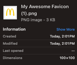
I used my initials here, but you can also use an actual logo if you have one, and it will resize perfectly upon download, as seen in this example with a logo I definitely wouldn’t get sued for using:
As you can see, this is the easiest, dumbest way to resize a logo file if you don’t have access to image editing software. Remember: anything, literally anything, is better than nothing.
Step 3: Download that bad boy as a PNG
Google slides makes this incredibly easy; transparency settings will even inherit as long as you set your background accordingly. Seriously, it’s so simple it should be illegal.
Step 4: Log into Squarespace, upload the file, and bask in the glory of your site’s fresh style
Unlike some other design features, the favicon option on Squarespace is housed in the general settings menu. You may have to refresh your site a few times to see the favicon appear, but it’ll be there.
Step 5: That’s it. You did it. You’re welcome.
I really tried not to get too preachy or cutesy about this topic, because I know that designers working themselves up into a froth over minutiae is unchic. But this is one of those pet peeves that is imminently fixable, and I do genuinely hope it helps some folks update this feature on their site. Free yourself from the little grey square! It’s free, it’s easy, and it’s even kind of fun. If you want to get creative, there are tons of free icon sites out there; I’ve always enjoyed making site favicons out of little 8-bit images or even low-res photos. Like I said above, the restrictions that used to exist for anything designated as an “icon” have been relaxed significantly in recent years. The world’s your oyster. Have fun out there.
Amanda Killian is a designer, writer, and photographer based out of Atlanta, GA.